In a Giffy with R

In this post I will attempt to have a go with animation using the R programming language. It seems like an arduous task no doubt, given the toolkit our output will be very simple yet still data sciency in spirit.

Here I will be utilizing the built in PlantGrowth data set within the R library.

The PlantGrowth data set is a collection of data from an experiment to compare yields (as measured by dried weight of plants) obtained under a control and two different treatment conditions. The levels of group are ‘ctrl’, ‘trt1’, and ‘trt2’. I hope this summary helps! 😊

And without further ado. Some code:

library(ggplot2)
library(gganimate)
library(gifski)
library(ggdark)

data("PlantGrowth")

p <- ggplot(PlantGrowth, aes(x=group, y=weight)) +
  geom_boxplot(aes(color = group)) +
  scale_color_manual(values = c("red", "blue", "green")) +
  dark_theme_dark() +
  transition_manual(group) +
  labs(title = 'Treatment: {Fertilizer Effect On Plant Growth}')

animate(p, renderer = gifski_renderer())

anim_save("temp.gif", animation = last_animation(), path = "C:/Users/Nunya/Business")

And the output.

Dot-dash plot in lattice

Here I am trying to emulate a plot done in the style exhibited by this link. Or colloquially known as Tufte style, where an emphasis on minimalism and accuracy are put into focus.

I chose to use the Iris dataset to visually present the relationship between sepal width and sepal length(in cm).

Here is the code below to recreate such a graphic:

library(lattice)

xyplot(Sepal.Width ~ Sepal.Length, data = iris,
       xlab = "Sepal Length (cm)", ylab = "Sepal Width (cm)",
       par.settings = list(axis.line = list(col="transparent")),
       panel = function(x, y,...) { 
         panel.xyplot(x, y, col=1, pch=16)
         panel.rug(x, y, col=1, x.units = rep("snpc", 2), y.units = rep("snpc", 2), ...)
       })

Visual Multi Variances Analysis

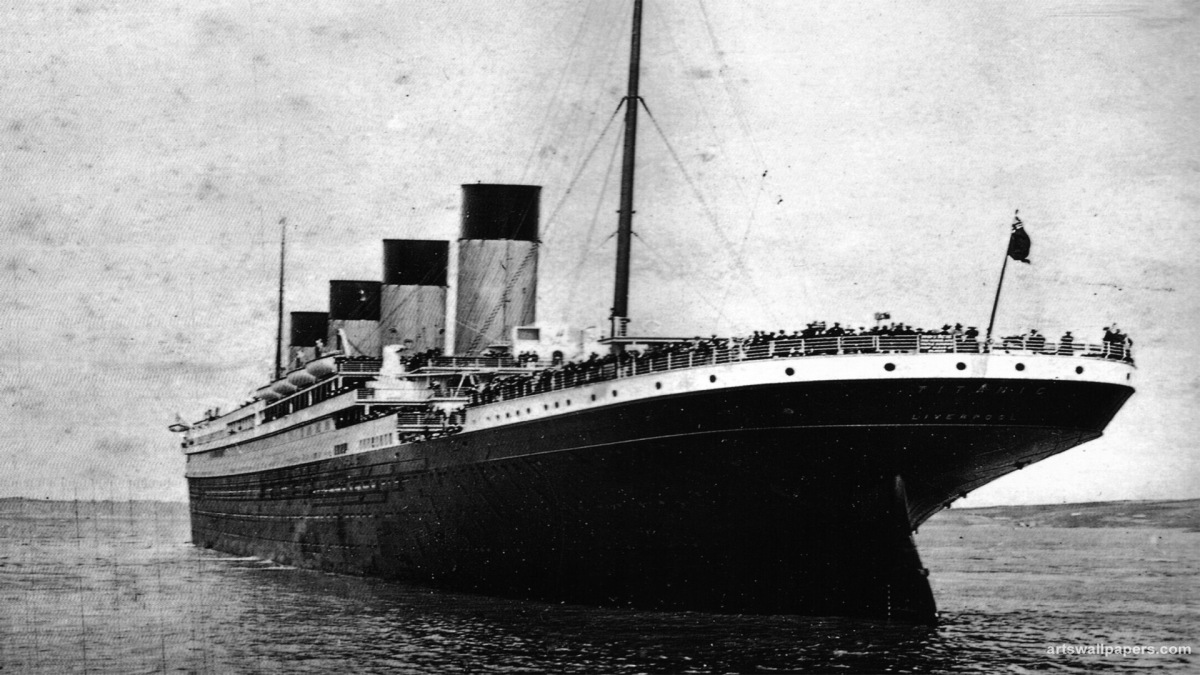
For this assignment I will be using the builtin Titanic data set within R. The four variables include: Class, Sex, Age, and Survival status.

It would be interesting to see visually how these variables effect the outcomes of survival within the tragic accident that happened over 100 years ago.

Below is the code to create a multivariable bar plot where each section is divided by class, paired by sex, and distinguished with their survival rate by “red” being no and “green” yes.

library(ggplot2)
library(titanic)

df <- as.data.frame(Titanic)

ggplot(df, aes(x = Sex, y = Freq, fill = Survived)) +
  geom_bar(stat = "identity", position = "fill") +
  facet_wrap(~ Class) +
  labs(title = "Survival rate by class and sex",
       x = "Sex",
       y = "Proportion",
       fill = "Survived") +
  scale_fill_manual(values = c("No" = "red", "Yes" = "green"))

From a quick glace we can see that females tend to always have a better survival rate compared to the men regardless of their passenger class. However passengers of the first class on average tend to have a much higher survival rate compared to the others overall.

Visualizing Correlation Data in the Mtcars Dataset

library(ggplot2)
library(reshape2)

# To load the mtcars data set
data(mtcars)

# To calculate the correlation matrix for the mtcars data set
corr_matrix <- cor(mtcars)

# A heatmap of the correlation matrix
ggplot(data = melt(corr_matrix), aes(x = Var2, y = Var1, fill = value)) +
  geom_tile() +
  scale_fill_gradientn(colors = c("white", "blue"), na.value = "gray", limits = c(-1, 1),
                       breaks = seq(-1, 1, by = 0.2), guide = "colorbar") +
  theme_minimal() +
  theme(plot.title = element_text(hjust = 0.5, size = 20)) +
  labs(title = "Mtcars Correlation Heat Map",
       x = "",
       y = "")

On this chart, correlational values are represented by shades of blue ranging from dark to light, indicating a range from positive to negative correlation. A quick analysis reveals that the blocks with positive correlation represent variables displayed on scatter plots, such as displacement and horsepower, and horsepower and quarter mile time in seconds.

# A scatterplot with a linear regression line of disp vs. hp
ggplot(data = mtcars, aes(x = disp, y = hp)) +
  geom_point(size = 3, color = "#2c3e50") +
  geom_smooth(method = "lm", se = FALSE, color = "#c0392b") +
  labs(title = "Scatter plot of hp vs. disp",
       x = "Displacement (cu. in.)",
       y = "Gross horsepower (hp)") +
  theme_minimal() +
  theme(plot.title = element_text(hjust = 0.5, size = 20, face = "bold"),
        axis.text = element_text(size = 12),
        axis.title = element_text(size = 14, face = "bold"))
# A scatterplot with a linear regression line of hp vs. qsec
ggplot(data = mtcars, aes(x = hp, y = qsec)) +
  geom_point(color = "#2c3e50") +
  geom_smooth(method = "lm", se = FALSE, color = "#c0392b") +
  labs(title = "Scatter plot of hp vs. qsec",
       x = "Gross horsepower (hp)",
       y = "Quarter mile time (sec)") +
  theme_minimal() +
  theme(plot.title = element_text(hjust = 0.5, size = 20, face = "bold"),
        axis.text = element_text(size = 12),
        axis.title = element_text(size = 14, face = "bold"))
## `geom_smooth()` using formula = 'y ~ x'

MTcars Data Set: A Visualization

To view a compiled doc file click the link the below

# Load the mtcars dataset
data(mtcars)
library(ggplot2)

# Create a density plot of horsepower
ggplot(mtcars, aes(x = hp)) +
  geom_density(fill = “red”, alpha = 0.5) +
  labs(title = “Distribution of Horsepower”, x = “Horsepower”, y = “Density”, caption = “Created by Pepper”)

# Create bar plots comparing the mpg of vehicles of different cyl count
ggplot(mtcars, aes(x = mpg)) +
  geom_histogram(binwidth = 2, fill = “#4C72B0”, color = “white”) +
  facet_wrap(~cyl, ncol = 3) +
  labs(x = “Miles per gallon (mpg)”, y = “Count”,
       title = “Distribution of MPG in mtcars dataset by Number of Cylinders”,
       subtitle = “Data source: mtcars dataset”,
       caption = “Created by Pepper”) +
  theme_minimal() +
  theme(plot.title = element_text(size = 20, face = “bold”),
        plot.subtitle = element_text(size = 16),
        plot.caption = element_text(size = 12),
        axis.title = element_text(size = 16),
        axis.text = element_text(size = 14),
        strip.text = element_text(size = 14, face = “bold”))

# Create a bar plot comparing qsec time to hp       
ggplot(mtcars, aes(x = qsec, y = hp)) +
  geom_point(color = “#0099CC”, size = 4) +
  geom_smooth(method = “lm”, se = FALSE, color = “#FF9900”) +
  scale_x_continuous(limits = c(14, 23), breaks = seq(14, 23, by = 1)) +
  scale_y_continuous(limits = c(50, 350), breaks = seq(50, 350, by = 50)) +
  labs(x = “Quarter mile time (qsec)”, y = “Horsepower (hp)”,
       title = “Scatter plot of qsec and hp in mtcars dataset with trend line”,
       subtitle = “Data source: mtcars dataset”,
       caption = “Created by Pepper”) +
  theme_minimal() +
  theme(plot.title = element_text(size = 20, face = “bold”),
        plot.subtitle = element_text(size = 16),
        plot.caption = element_text(size = 12),
        axis.title = element_text(size = 16),
        axis.text = element_text(size = 14),
        legend.position = “none”)

Module #4

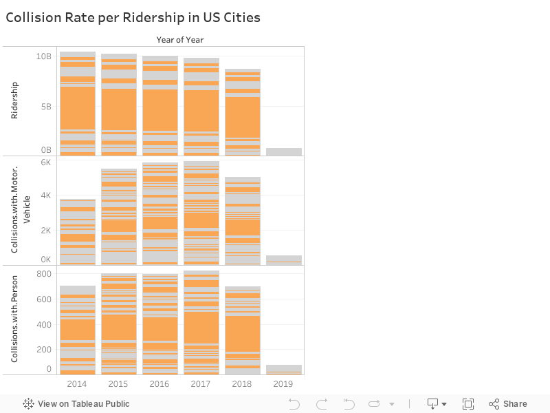
Collision Rate per Ridership in US Cities

link to tableau public for interactive map

Above is a stacked bar chart depicting the various Collision Rates between automobiles with other automobiles as well as persons within various US Cities. I chose to display this graph in a stacked way for concision and a more pleasant viewing experience. Given the size of the data set which includes thousands of rows in CSV format, visualizing this in a typical time series bar or line chart would simply be sub optimal. Especially given the sheer range of the data set, where some cities have ridership’s in the billions while others only in the thousands.

The data showcases that most accidents are concentrated within densely populated areas, as is expected. With the New York metro area being the hot spot for these unfortunate accidents, since it boasts almost 5 billion ridership’s per year it is not unexpected that they also seem to suffer the worst when it comes to number of accidents reported.

Module #3

An infographic based on the last assignment that was based on the topic of international divorce rates. Here I have highlighted the regions and countries that score both high and low in their marriage divorce rates. The charts were derived from the data-set linked in the previous post, and exploratory analysis was done with the formatted CSV file with the use of such technologies: Rstudio, dplyr, ggplot2, and Adobe Illustrator