
library(ggplot2)
library(reshape2)

# To load the mtcars data set
data(mtcars)

# To calculate the correlation matrix for the mtcars data set
corr_matrix <- cor(mtcars)

# A heatmap of the correlation matrix
ggplot(data = melt(corr_matrix), aes(x = Var2, y = Var1, fill = value)) +
  geom_tile() +
  scale_fill_gradientn(colors = c("white", "blue"), na.value = "gray", limits = c(-1, 1),
                       breaks = seq(-1, 1, by = 0.2), guide = "colorbar") +
  theme_minimal() +
  theme(plot.title = element_text(hjust = 0.5, size = 20)) +
  labs(title = "Mtcars Correlation Heat Map",
       x = "",
       y = "")
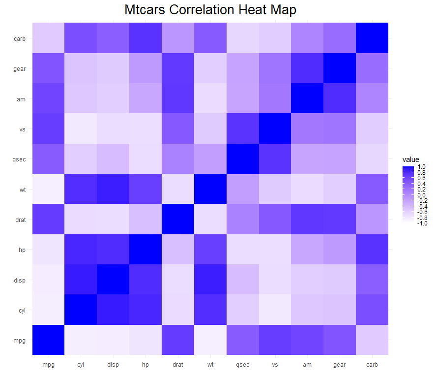
On this chart, correlational values are represented by shades of blue ranging from dark to light, indicating a range from positive to negative correlation. A quick analysis reveals that the blocks with positive correlation represent variables displayed on scatter plots, such as displacement and horsepower, and horsepower and quarter mile time in seconds.
# A scatterplot with a linear regression line of disp vs. hp
ggplot(data = mtcars, aes(x = disp, y = hp)) +
  geom_point(size = 3, color = "#2c3e50") +
  geom_smooth(method = "lm", se = FALSE, color = "#c0392b") +
  labs(title = "Scatter plot of hp vs. disp",
       x = "Displacement (cu. in.)",
       y = "Gross horsepower (hp)") +
  theme_minimal() +
  theme(plot.title = element_text(hjust = 0.5, size = 20, face = "bold"),
        axis.text = element_text(size = 12),
        axis.title = element_text(size = 14, face = "bold"))
# A scatterplot with a linear regression line of hp vs. qsec
ggplot(data = mtcars, aes(x = hp, y = qsec)) +
  geom_point(color = "#2c3e50") +
  geom_smooth(method = "lm", se = FALSE, color = "#c0392b") +
  labs(title = "Scatter plot of hp vs. qsec",
       x = "Gross horsepower (hp)",
       y = "Quarter mile time (sec)") +
  theme_minimal() +
  theme(plot.title = element_text(hjust = 0.5, size = 20, face = "bold"),
        axis.text = element_text(size = 12),
        axis.title = element_text(size = 14, face = "bold"))
## `geom_smooth()` using formula = 'y ~ x'

